Scott Chambliss had worked with JJ Abrams for years, including on Alias and Mission: Impossible: III, but redesigning the Star Trek universe was probably his most ambitious undertaking. In an exclusive interview with TrekMovie, the production designer talks about the challenges of taking on Trek, fan feedback, and also what we can look forward to in the upcoming Art of Star Trek book.
Interview: Scott Chambliss – Production Designer on Star Trek
TrekMovie: Although you have been in production design for film and TV for a long time, including winning an Emmy for Alias, Star Trek was your first big science fiction project? Was that intimidating for you?
Scott Chambliss: The sci-fi being new to me is definitely true, that is also been true of every project in my career and that is one of things I love about the job I do. Every project I get to take on is a grad school thesis course. I can jump into something and learn everything I can about what it is and what is going on. And it changes, obviously, because it is a job to tell a visual story dramatically and articulately. So, in that respect, that was super-exciting. The drawback is the baggage that this story brings with it, because it is kind of like a religion for some people, at the most extreme. And at the least extreme, it has avid fans who cherish every detail of what has come before. Striking a balance between telling a dramatic visual story and not f–king with the canon in a way that disturbs the people that really cherish it, was the daunting bit and that required a lot of assistance from people who really knew the history of the story, like John Eaves.
TrekMovie: John was one of the only old-school guys you had on your team.
Scott Chambliss: He was. We were tasked to not re-invent, but kind of polish the story and make it interesting for not only the old audience, if they would stay with it, but for a new audience. And John was able to adapt in a really brilliant way, to stay plugged into both the history and honoring that, but also move with us into the future.
TrekMovie: Well I also think that both Ryan Church and James Clyne also did some great work tying those elements together, especially on the USS Kelvin, which has been a big fan favorite.
Scott Chambliss: That is how JJ [Abrams] and I wanted to start the movie, with ‘oh look it is a Star Trek space ship!’ and make it really recognizable. Supe it up and make it more lavish, because we had more money, but honor what has come before and make it familiar in a way that old fans would like. But that was also a dramatic ploy on our part, because in doing so, we wanted to create the highest contrast possible for the Enterprise. Because how do you make the Enterprise feel fresh and new, if it looks exactly like something we have seen for the last 40 years. The Kelvin was the contrast we did to hopefully make the Enterprise feel cool and new.
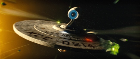
Kelvin made to create bridge from old to new
TrekMovie: Would you say doing the Enterprise inside and out was the most challenging and intimidating…
Scott Chambliss: [cutting off] Yes! Yes! And again, yes! [laughs] The outside actually came along pretty early in the game, because the whole idea that JJ embraced thoroughly was about using the Eero Saarinen approach–he was the futurist architect from the late 50s and 60s who designed the TWA terminal at JFK airport. I originally presented the concept of using him for inspiration simply for Starfleet Earth home base, the assembly hall, but he was so turned on by that, JJ suggested applying the concept to everything Starfleet. So that is when I really started playing with the exterior of the ship. But the interior, the bridge, all that iconic stuff, that was much more laborious.
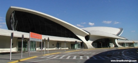

60s era Eero Saarinen architecture inspired new Starfleet look
TrekMovie: Now that it is all done, looking back at all the production design for the movie, what do you think worked best, and maybe what do you think didn’t work as well as you may have wanted?
Scott Chambliss: I think for me, and for the intention that JJ and I had for telling the story visually, I think it all worked pretty well. I am not talking in context of what came before, but what we set out to do. If I could do something different, there is one sequence that I don’t like, in terms of my work, and that is the bar scene in Iowa. The interior, I just can’t stand that, with the location that I presented, I don’t think it worked at all. Fortunately for me, the rest rest of every element did work. The script was so great, the action was great, the performers were great, it was lit and edited beautifully, but visually speaking, I don’t think that worked.
TrekMovie: Was that a real location or a set?
Scott Chambliss: That was a real location, it was an American Legion location from World War II, in Los Angeles. That was my concept. We are in Iowa, it is old, it has been updated, but one of those places that has been there forever. But for me ultimately, it was too easy and I didn’t buy it. It didn’t have enough of its own identity. Everything else in the story, visually, was very sharply defined. But that set and that location wasn’t. I think I am the only one on the team that feels that way.
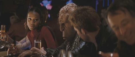
Chambliss feels Iowa Bar set could have been more distinctive
TrekMovie: I have heard a lot of feedback on a lot of things, and I haven’t heard anyone complain about the look of the Iowa bar scene. In fact, in my review, and others noted this as well, it was appreciated that you guys didn’t do a whole ‘hey look we are in the future’ Star Wars cantina over the top thing, and you kept it realistic and relatable.
Scott Chambliss: Well that was the goal, to make it realistic and relatable, I just don’t think that it went strong enough in its own original direction, while maintaining the reliability. No matter what job I am doing, no matter how silly or important, I want it to be visually distinctive, otherwise what is the point?
TrekMovie: JJ seemed adamant to do as much location shooting as possible, requiring your team to ‘future-ize’ all sorts of things, from Long Beach City Hall, the Rose Chapel, etc. Did you prefer that, or would you have wanted to start from scratch and build your own sets?
Scott Chambliss: No preference, both are part of my job. Actually the excitement of finding locations we can adapt in all the projects he and I have done together is one of my favorite parts of the process, because I get to scour the world and see what is out there. I can see what might be a vivid and delicious way to tell the story we want.
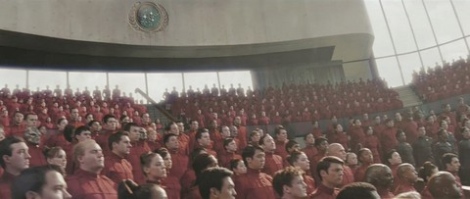
Long Beach City Hall was transformed into Starfleet Academy
TrekMovie: Well, there is one location that has been a little controversial…
Scott Chambliss: Is it Budweiser?
TrekMovie: Why yes it is! The controversy, and I noted this in my review, was that while the notion of making it big, more industrial and even using a real-world location was fine. But there were a few shots where it just didn’t feel redressed enough, like when Kirk was chasing Scotty in the pipes, and it was just too obvious that this was just some factory somewhere, with 50s era fixtures, etc. The same was true in parts of the Kelvin, shot at the power plan in Long Beach, where again it took you out of the scene as it didn’t really feel like you were on a space ship. I thought it worked at times, but other times it didn’t, others just didn’t like it at all. So that is my feedback and their feedback.
Scott Chambliss: Fantastic, well everyone is entitled to their own opinion…I have nothing to say to that.
TrekMovie: Although I loved the movie, this was one of my criticisms of it. You know that Trekkies can get worked up over just about anything.
Scott Chambliss: [laughs] Totally, I see that. It is one of the things I was originally afraid of, but then came to appreciate. People who have loved this story, and all the series and movies for so many years…the passion they have for it and the knowledge, and what they want it to be, is really sweet. Although it is not a religion and not a cult, but it is something that that specific audience so passionately cares about. And how many of those things are there in the entertainment biz?

Chambliss appreciates the passion of Trek fans – even when nitpicking the ‘Bud-gineering’ sets
TrekMovie: Let’s talk about the book, "Star Trek: The Art of the Movie" which comes out around the time of the DVD and Blu-ray. Can you talk about what you are doing with regards to the book and what we are going to see?
Scott Chambliss: The book is a collection from all the visual collaborators on the movie, from costumes designers, prop masters, creature designers, make-up designers, all the people who part of our team, the visual effects team–all of that work is going to be represented in the book. We all have a voice in terms of telling the story in how we made the movie. What I have been doing is photo-editing the layouts, and adding a little bit of the back-story that hasn’t been there before, and also making sure the different artists are appropriately credited for their work. It has process photographs, it has drawings, it has got a lot. It is very cool.
TrekMovie: There were a number of things that were sketched out that were cut out of the final film or even the final script, are we going to see those in the book?
Scott Chambliss: Yes. Most of that stuff is in there. There was a lot of cool stuff that went away in the final edit, not because it didn’t work, but because it didn’t help the story. I would have to say the difference between the first cut that I saw that had a lot of that material and the final version, was night and day. That is where JJ and his editing team are such geniuses. They don’t worry about cutting waste, no matter how people love it, if it is not helping the story. The significant stuff is in the book, and it is pretty cool.
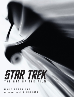
"Star Trek: The Art of the Movie" – including designs that didn’t make it into the final film
TrekMovie: Your team did a lot of work on some cool stuff which was cut, such as all the designs of the Rura Penthe prison. Is it hard for you to see that go from the final film?
Scott Chambliss: No, not really. As long as it is a good story and well told, I don’t really care what shows up and what doesn’t. Whatever makes the movie stronger, I am all for. I have to agree, I loved those sequences. They looked really cool and they gave the bad guy [Nero] a little more heft, but it didn’t help the story, so it made sense that JJ cut it.
TrekMovie: Let’s assume the same team gets together for the next movie, including yourself. Have you put any thought into what you might like to do? What kind of challenges you would like to take on?
Scott Chambliss: No. I really don’t think about that kind of stuff. When I am done with a project it is over, and despite having worked so often with JJ in the past, I never take it for granted that I will work on the next one. I hope every project comes together because it is people choosing the people they want to work with and the best people for the job. I wouldn’t say that just because I designed the most recent Star Trek, that I am the best person for the next one.
Also the other thing that I think that is important to get across for people that are not in the biz and for people who are really passionately follow this stuff, I think there is the impression that what you see on the screen is 100% what we set out to do. Honestly, what ends up on the screen is always a miracle, because there is the script version of what you intend to make, then in production you wind up creating another version where you are collaborating with all these people who have all these different gifts, and in post-production it becomes another movie, quite different from what you thought you were making. That was certainly the case on every episode of Alias, and to a degree it was the case on Star Trek. We had this notion of the movie we were making, visually and with characters and all of that stuff. But the fullness of it, and the detail, and the strength wasn’t revealed until the very long post-production process. And so when people look at a thing
like a set, like Budweiser, or they look at a performance of one of the main characters, and they go ‘that was always the intention’, sometimes you dive in for the best version of what you intend to do, and you hope for the best. Sometimes it is universally accepted and appreciated, and other times it is not. Nothing about the film making process is concrete from the get-go, I guess that is what I am saying.
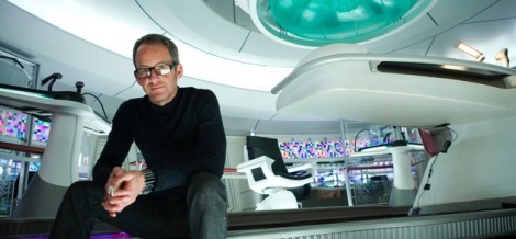
Chambliss on the bridge of the USS Enterprise
See Chambliss, Zimmerman and more this Sunday in LA
On Sunday September 27th the Art Directors Guild Film Society will be honoring the the designers of Star Trek movies at an event at the Egyptian Theater in Hollywood. Here is a blurb explaining the event from the press release.
John Jefferies, Joseph R. Jennings, Herman Zimmerman and Scott Chambliss will participate in a panel discussion to be moderated by Production Illustrator Daren R. Dochterman, featuring video clips from their work on Star Trek, as well as a screening of the Director’s Edition of Star Trek: The Motion Picture. Documentary video clips of the late Harold Michelson, Production Designer of Star Trek: The Motion Picture, will also be shown
General admission: $10. American Cinematheque members: $7. Students/Seniors with valid ID: $8. 24-hour ticket information is available at 323-466-FILM (3456).
Art book coming November
And you can pre-order "Star Trek: The Art of the Movie" which comes out November 17th.


0 comments:
Post a Comment